The tennessee titans unveiled a comprehensive rebrand Thursday, releasing new uniforms and a redesigned logo intended to marry the franchise’s Oilers-era heritage with elements from its nearly 30 years in Tennessee.
What Is Changing Now?
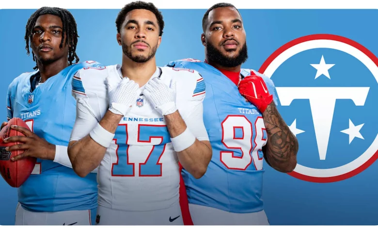
The refresh includes a suite of uniform and branding changes. The primary home look will pair Titans blue jerseys with white pants or britches; the primary road look will use white jerseys with light blue or white pants, and the team will retain the option to wear white at home games. At home, the word TITANS will be stitched above the numbers across the chest plate; on the road jerseys, TENNESSEE will occupy that same position. Numbers will appear on the front, back and shoulders. Light blue (Titans blue) jerseys feature white numbers outlined in red, while white jerseys feature light blue numbers outlined in red.
The primary logo is an evolution of past marks: a redesigned white “T” inside a Titans blue circle with white and red accents, and the familiar three white stars representing the corners of the state. That mark will appear on both sides of a white helmet that features a white facemask and a unique stripe across the top. The team also introduced a secondary, football-shaped logo combining a “T” and “N. ”
Burke Nihill, President and Chief Executive Officer of the Titans, framed the initiative as a continuity move: “We wanted to come up with something that took the best parts of all of that and bring it together in a way that makes sense…. we’re doing it in a way that is going to set the course of this organization for decades to come in a pretty special way. ” Erin Swartz, Senior Vice President of Brand Marketing with the Titans, emphasized the role of fandom in the creative choices: “I think that Titans blue is a really bold color, a really powerful color…. It’s a way for fans to uniquely show their support, and really fill stadiums both home and away with Titans blue to support their team. “
What Happens to Tennessee Titans Identity and Fan Engagement?
The redesign explicitly nods to the franchise’s Luv Ya Blue Days as the Oilers while drawing on nearly three decades in Tennessee. The team cites throwback Oilers jersey sales, fan surveys and focus groups as evidence shaping color and styling choices. A handful of practical shifts stand out:
- Helmet color: a return to white helmets with a white facemask and a new top stripe.
- Brand language on jerseys: TITANS on home chests, TENNESSEE on the road chests.
- Color treatments: Titans blue as a uniquely identifiable team color, with red outlining on numbers for contrast.
- Logo evolution: primary round mark without flames and a new secondary football-shaped mark combining T and N.
The timing of the change is notable in broader franchise context. The move to white helmets and an Oilers-style blue coincides with other organizational transitions: the team is preparing to move into a new stadium in the near term, and there has been turnover in coaching and roster-building activity that the organization has tied to a next chapter approach. The uniform and logo refresh is being presented as a visible anchor for that transition, with the possibility of retro elements like the Mr. Titan mark appearing on game days.
What Comes Next?
The organization has cast this as both homage and forward planning. The new look removes certain past elements (the flames) while keeping symbolic ties—three stars for the state, a T that reads as familiar—and places a premium on Titans blue as an identity color chosen through sales and fan feedback. Burke Nihill described the effort as “building on the legacy of what got us here. ” Erin Swartz highlighted fan-driven validation of the color and styling choices.
For fans, players and the local market, the immediate expectation is to see the white helmets, refreshed primary mark and the new uniform combinations on the field in the coming season. The team has positioned the rollout as the visual start of a new chapter that ties together Oilers nostalgia and the franchise’s Tennessee tenure, with the rebrand intended to be durable for years ahead.
Stakeholders should watch how the new marks and the white-helmet aesthetic are adopted in game presentation and merchandise, and how the club layers retro elements in future activations as the organization moves forward as the tennessee titans